44PL from Joeb Moore & Partners on Vimeo.
44PL Research
07.2.2013
44PLOpportunistic House
Keeping up and moving beyond the [Dow] Jones
Premise
There is a simple and elegant thesis or question at the base of this project.
Is a house something more than a sum of its parts—more than a utilitarian equation of means and ends? Can a house embrace and comment on our prosaic rituals, while also elevating and promoting our awareness of a deeper, changing world around us? Surely it must try. The suburban, consumerist house today is largely trapped or entangled in its own social constructs and depths. Just think of all those neo-traditional, developer Colonials or Shingle style houses that stand in for single-family, private house and lust for lifestyle today. In our flattened consumerist landscape today, is a house really more than simply an effect of its own representations (mirror or light)? Is this ambivalence in fact an opportunity? Can a house be activated programmatically, materially and spatially to reconfigure the normative tropes, conventions and representations (images), the social and categorical dimensions that largely author it to begin with? BIG question, one that is not so much meant to be answered as tested in the field itself so to speak…. in practice (repeatedly).
Technique
Using the operative technique of collage and the concept of super-position and phenomenal transparency latent in collage, this project deploys techniques of superimposition and simultaneity to exaggerate a series of social-perceptual dilemmas rather than resolve them. It is worth remembering, collage was deployed as a modernist critique and attack on the centrality of perspective theory. In this project we have deployed collage (multiplicity + abstraction) against representation (identity) by letting the house work psychologically on a number of levels simultaneously -familiar and fresh, abstract and nostalgic, serious and witty, light and heavy, straightforward and cunning. The search for a house and a home-coming is indeed a nostalgic journey here, filled with hope and promise, but it is never allowed to lapse into sentimentality. The house is an open, flexible space that allows for multiple reconfigurations and possibility of use and discovery, but is also grounded, well-sited and recognizable within the context of its suburban neighborhood. No easy task when resolving a program of 15,000 square feet.
Response
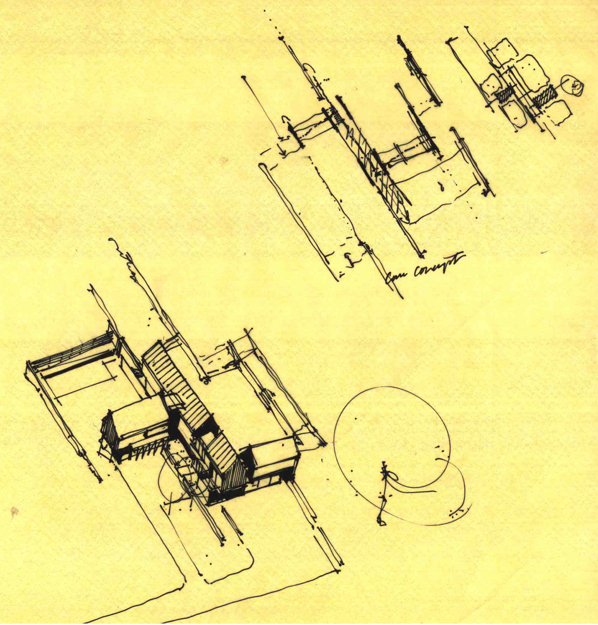
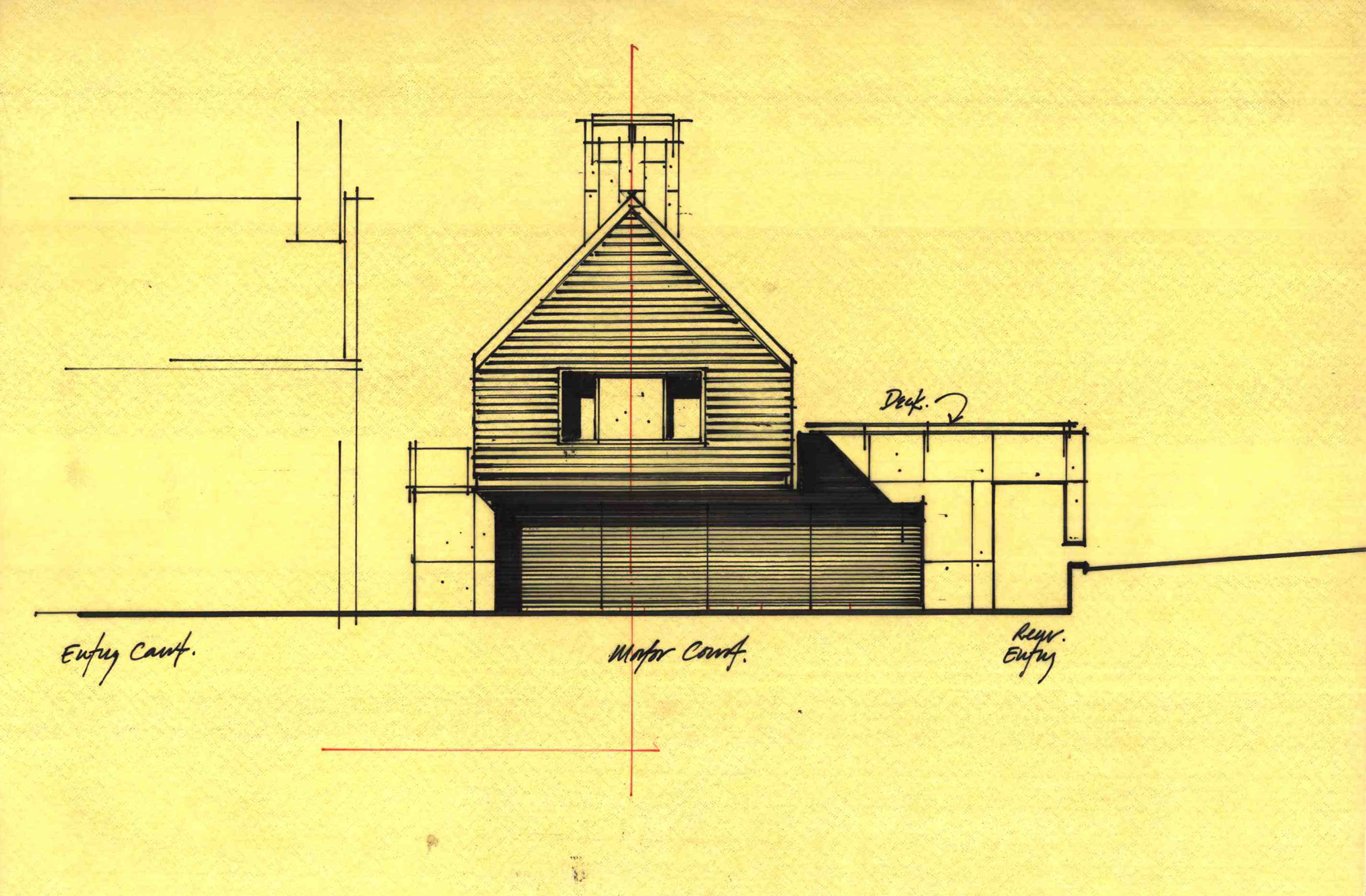
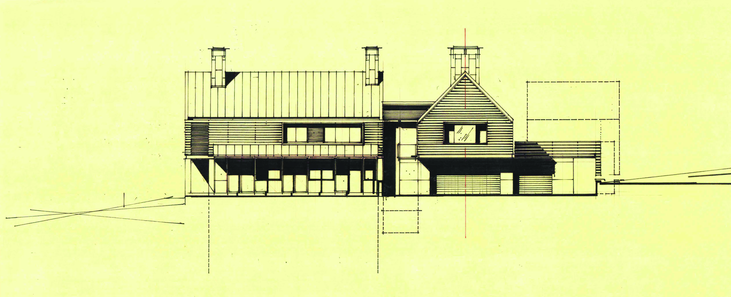
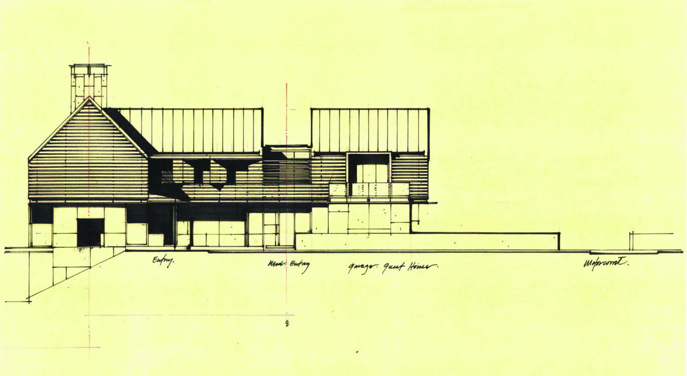
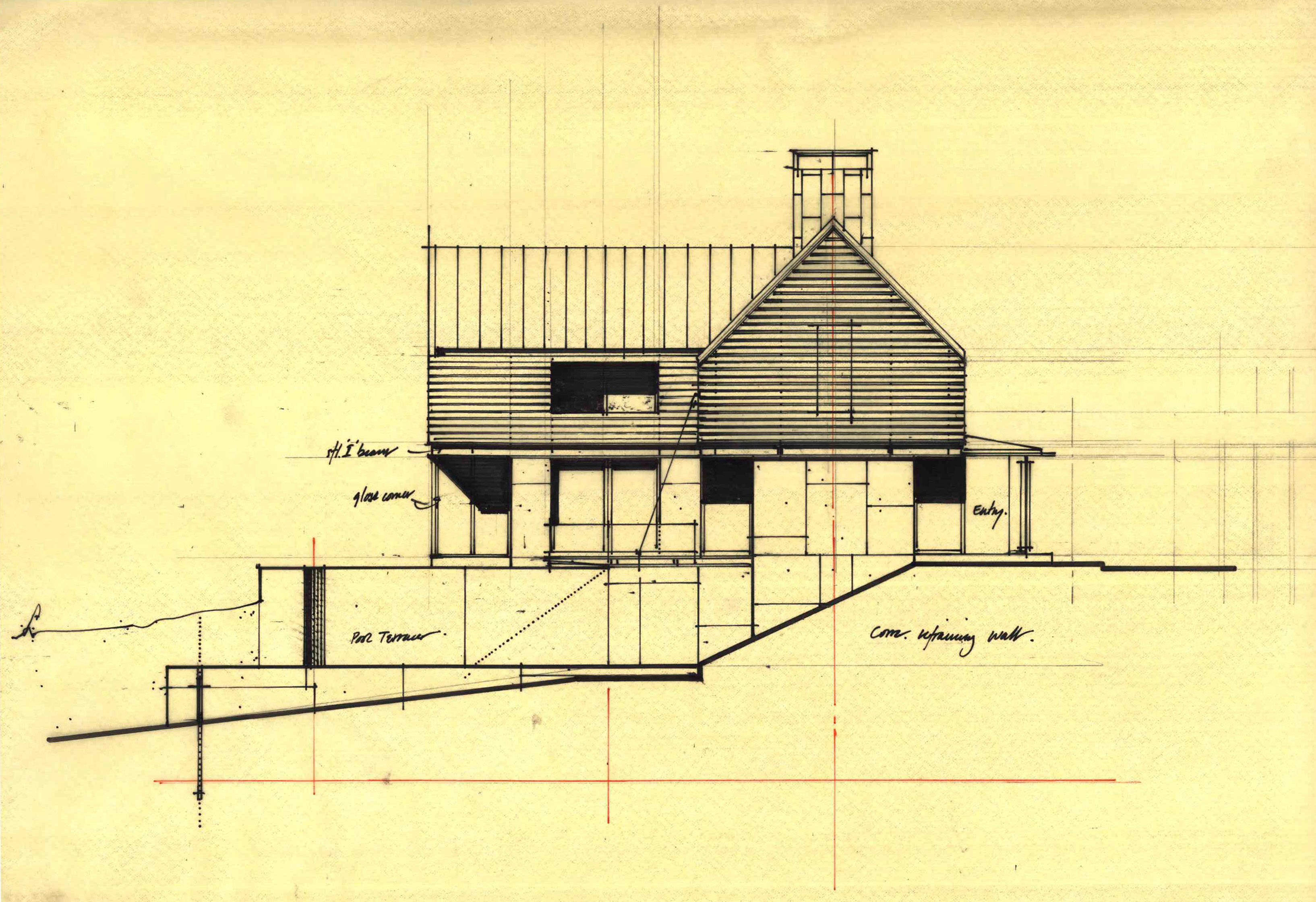
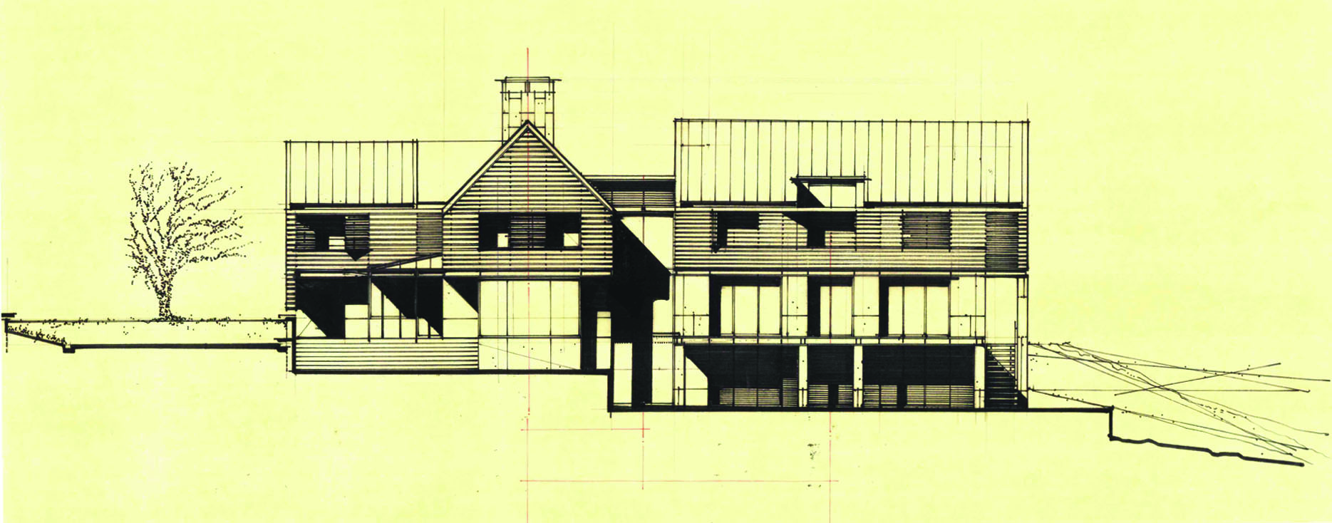
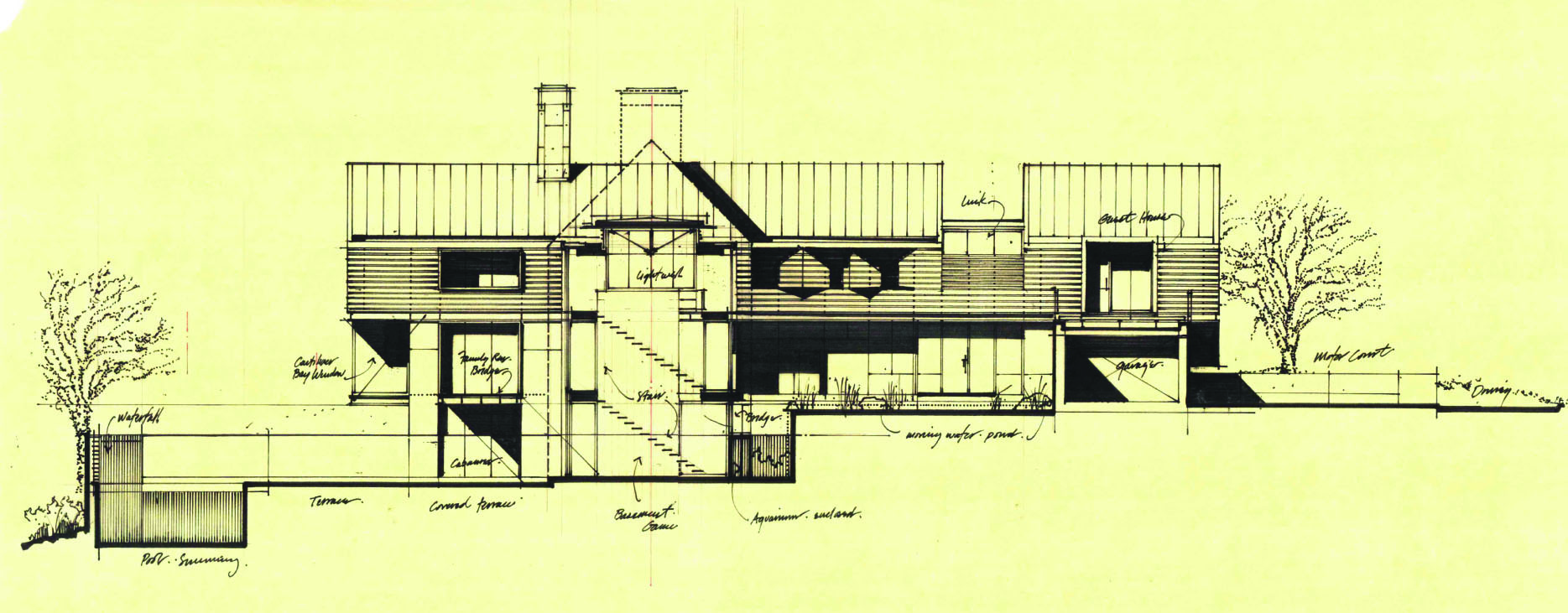
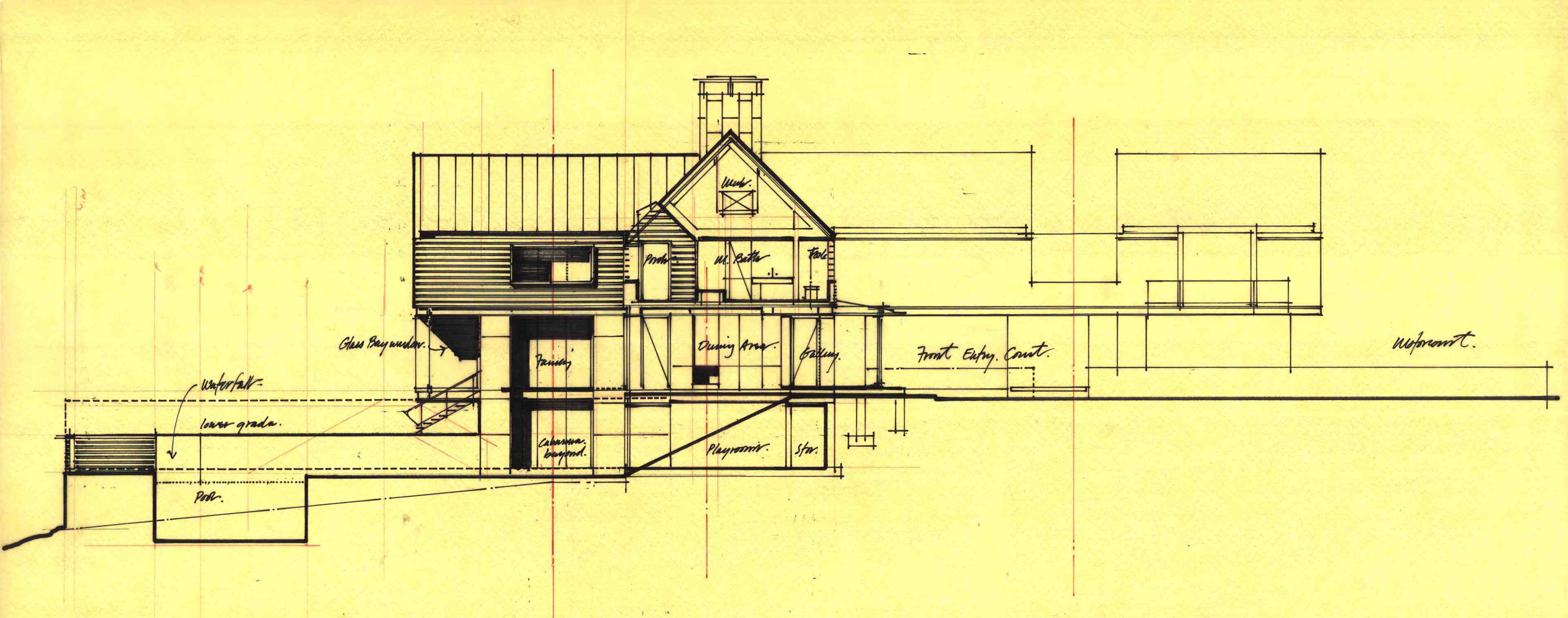
In response to a 35 foot sloping grade change of the site and super-sized (read: extra/large social-economic class) suburban streetscape surrounding the site (lower Fairfield county), the site strategy is a simple operation of gradation and contrast. Through a series of cascading site and retaining walls the property in plan is organized into a series of tiered gardens, courtyards, and active fields that recede back in descending or ascending order from the proto-suburban front lawn to the entry + motor courtyards, to the active entertainment (pool area) and play areas at far upper reaches of the site. In section and elevation, the building mass is split into two distinct strata: the concrete and plaster foundation and first floor “base”. These walls and piers are linked physically and conceptually to the ground and the site – to the elongated retaining wall system and the tiered landscape.
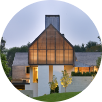
The form of the upper story follows traditional wood frame construction. It is composed of a series of simple cedar gable-house figures with the scale and feel of a basic house block. These gable boxes have been kept as tight, thin and crisp as possible in their detail and effect. The series of repetitive bay windows index each of the bedrooms and face the southwest playing fields. The two primary gable forms and the various bays all appear suspended above, but balanced on the steel eyebeams that separate the masonry base of the building and wood structures above it. The contrast between private spaces in the wooden frame is suspended above the open, flexible plan of the various main living spaces and outdoor terraces, porches, gardens etc.
The owners requested and asked for a house and spaces that would be a quiet, but strong backdrop to the incredible bustle and activity of this large, outgoing family. This simple contrast between the life and activity of the house and the white walls and warm wood works to stunning effect. The waterfall + stream became the central circulation space between all of the various three stories of the house and the differing range of activities all around it. This space is best experienced and understood not in plan but rather in section and while moving—like the waterfall and stream itself. It is the cut or gap that allows views through the entire site and house while providing light, water, and motion to the lower basement level that opens directly to the pool areas.
The house is simple in form and materials, but powerful. It relies on the abstraction of conventional forms and details to bring out an entirely new, open and most importantly, highly flexible indoor/outdoor living spaces for the family.
